Crossroads Rebrand
Branding // Web // Print // Signage
Objective: Redesign Crossroads Bible Church’s brand so that it reflects their mission, vision, and values more effectively.
Audience: Church attendees, guests, and neighbors in the great Grand Rapids area.
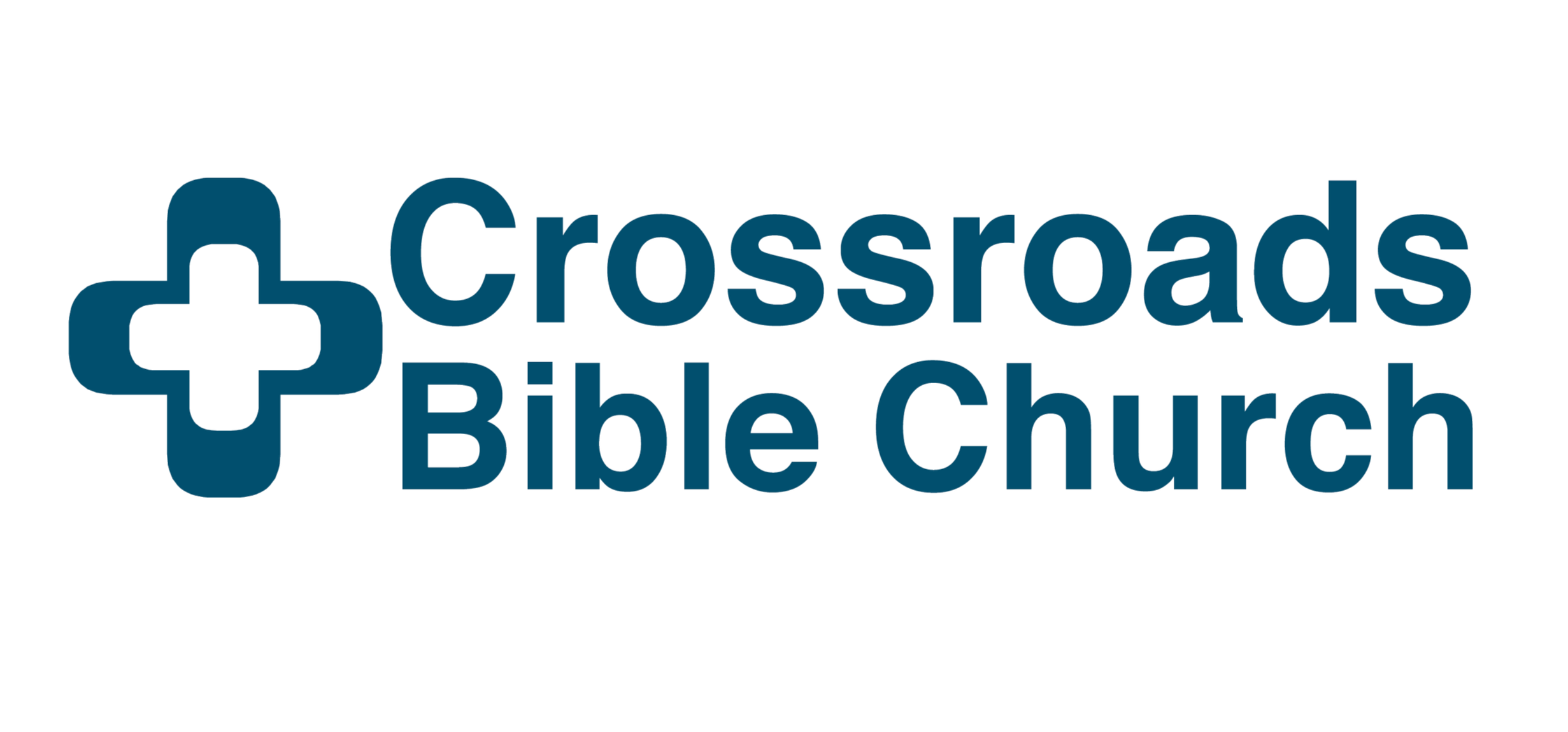
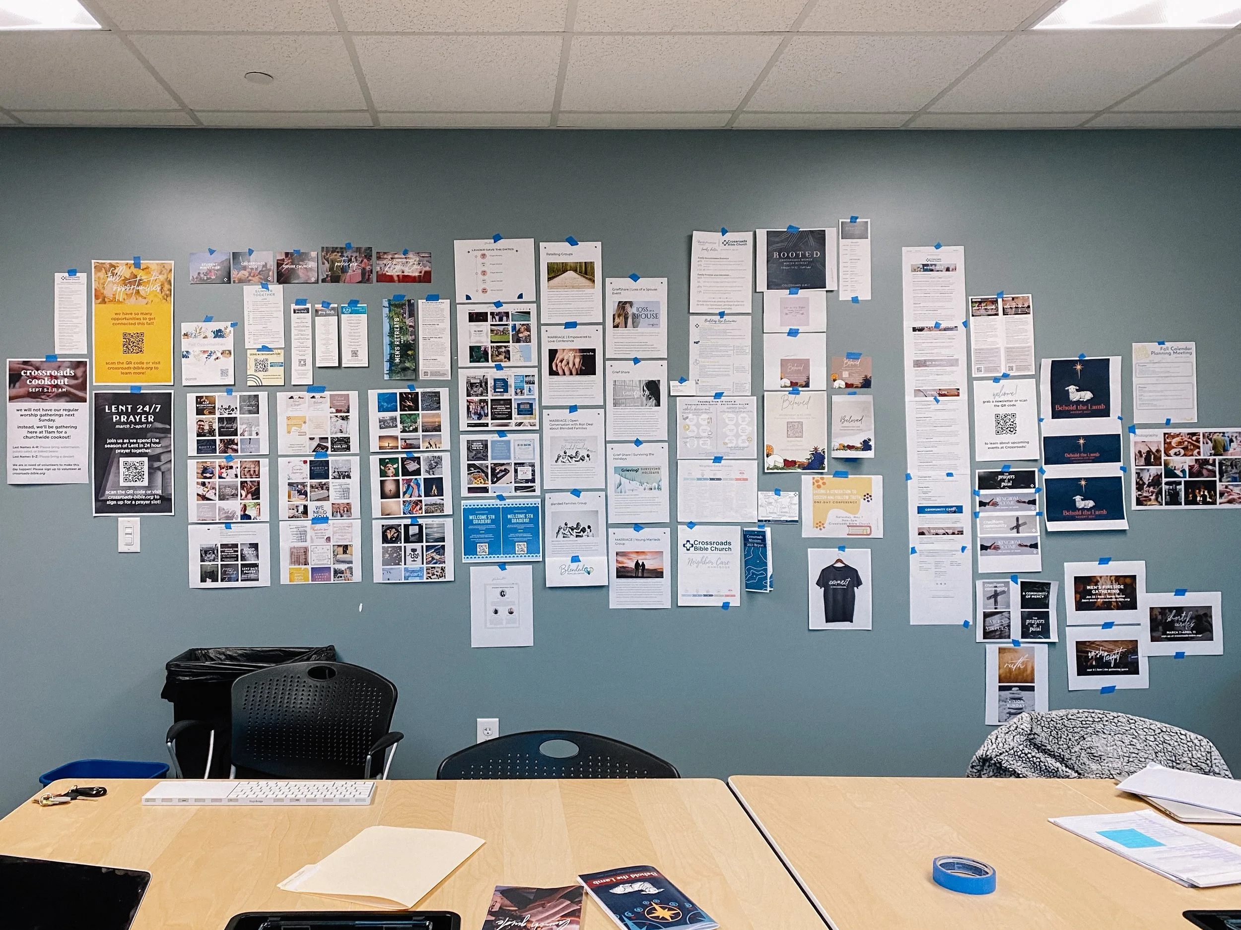
Solution: When I started my role, there was very little consistency in the designs produced across the organization. Each ministry area functioned very much in a silo and was responsible for its own communication to the congregation, which led to widely varying designs that did not look like they came from the same organization.
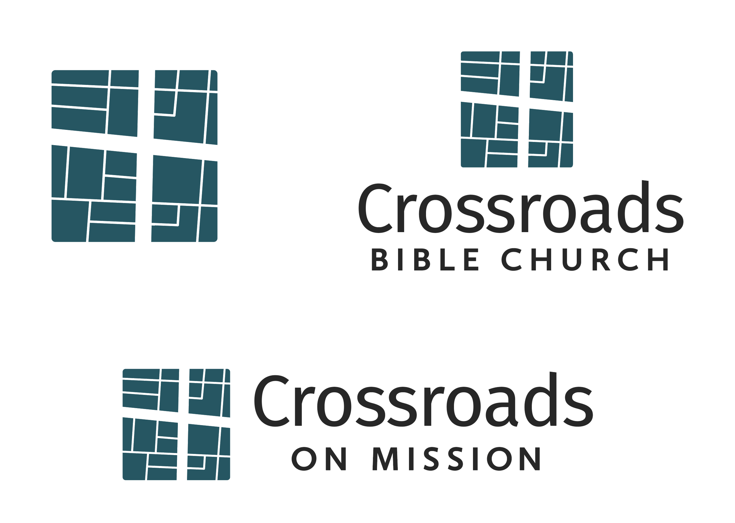
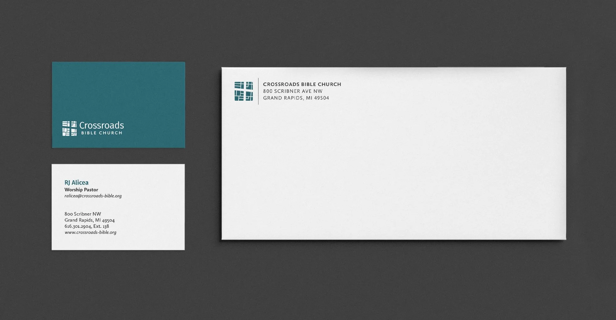
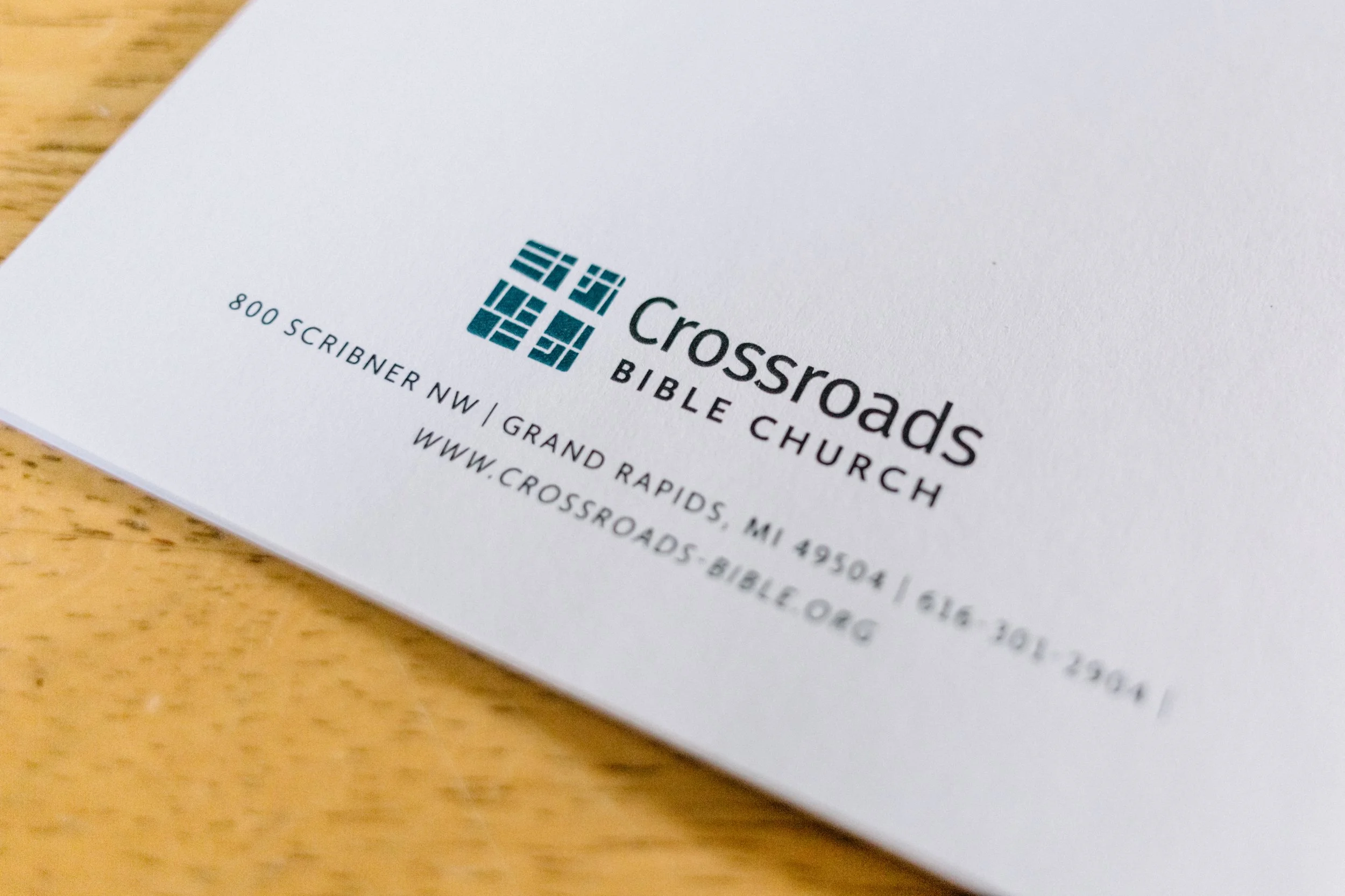
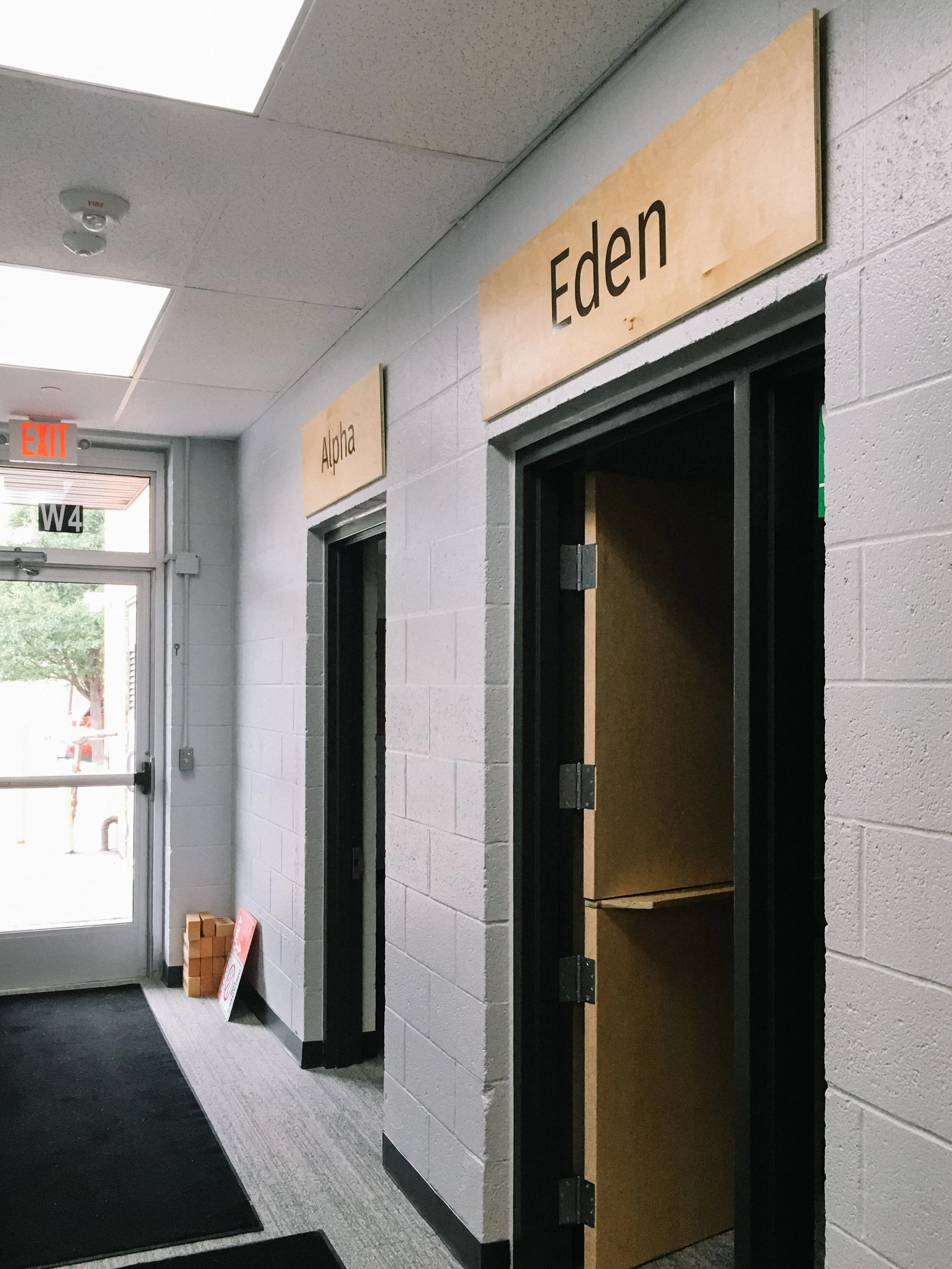
By leading the staff team through a series of brainstorming exercises, I was able to come up with visual inspiration that reflects Crossroads’ heart and values. From there, I ideated several visual directions before landing on one that emphasized the importance of Crossroads’ physical location within downtown Grand Rapids, while still retaining the simplicity of the original cross-shaped logo design.
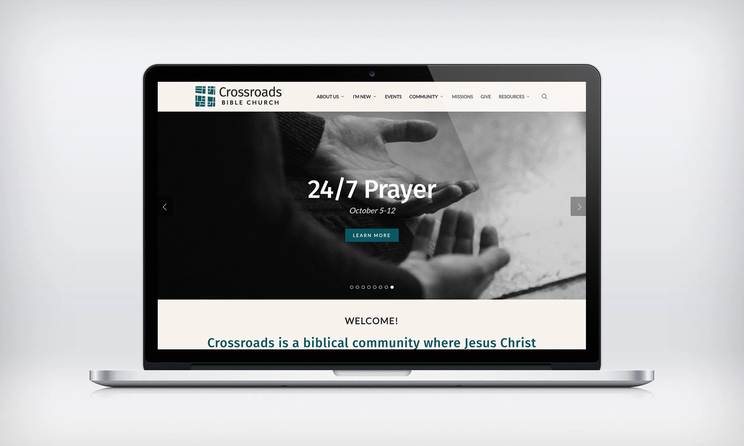
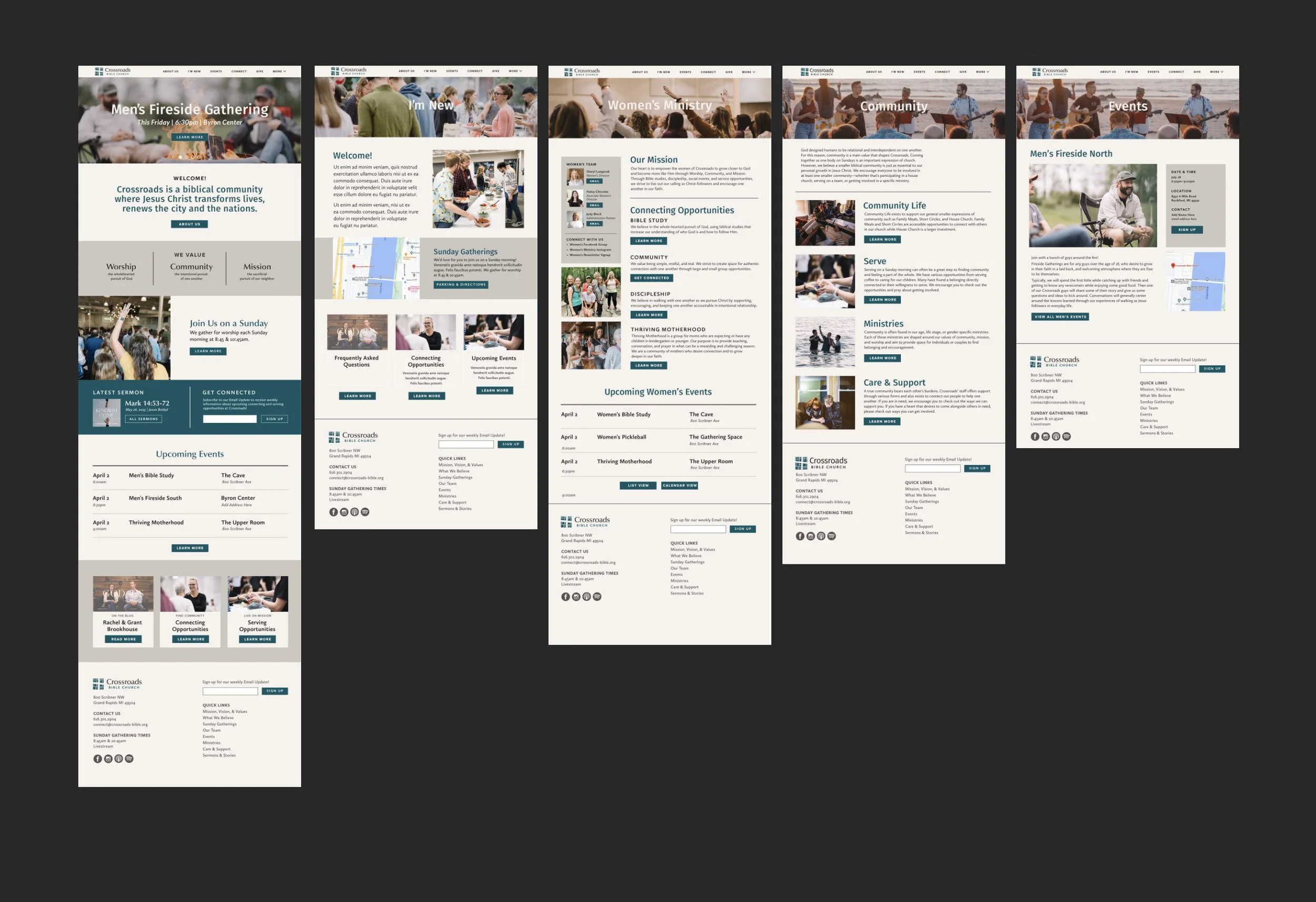
I also oversaw a complete redesign of Crossroads’ website.
After gathering feedback from congregants and staff via an online survey, I reorganized the sitemap in a more intuitive way, and then designed each page to match up with the new brand guidelines. I worked with a local web developer to bring this site to life, in time for our Fall ministry kickoff that year.